How to create effective data visualization with videos
Data visualization is essential to manage and map data. In this post, you will find out how to create effective data visualization with videos!
Summary:
Data Visualization is essential to manage, map, and make the huge amount of data that every business today collects readable and operational. Above all, it’s about knowing how to communicate them in the best way: to customers, employees, stakeholders, and financiers. And, if we talk about digital communication, there is no more powerful and versatile tool than video. What are the tips for creating effective data visualization through video? We can collect them in four decisive points:
- Implement animated graphics: much more engaging and functional.
- Insert storytelling elements (or, even better, “data telling”).
- Aim for personalization, designing communications based on the recipients.
- Optimize your videos with an omnichannel perspective.

Introduction to effective data visualization
The Digital Transformation has transformed the world of business forever. It’s a total and radical paradigm shift that, above all, has triggered continuous innovation. At the base of all this there is something basic: data. We’ve already talked about the benefits of data visualization.
Big Data is the true input and simultaneously the output of the digital revolution. That’s why the top priority for any business today is to equip itself with systems that make it possible to manage, “read”, and unravel this enormous mass of information.
Among these “mapping” systems, Data Visualization plays a fundamental role. Let’s see why, starting with some statistics that leave no room for doubt.
The effectiveness of video for digital communication – some data
Let’s start with our daily habits, which are well summarized by these first numbers:
- By the end of this year, video will make up as much as 82% of total internet traffic. In 2017, this figure was already significant at 73%, but the growth has been super strong, and all the more so after the complex stages of the Covid-19 pandemic (source: cisco.com).
- By the end of 2021, there were about 2.3 billion worldwide monthly active users on YouTube (source: oberlo.com).
- More than 1 billion hours of video are viewed daily, also on YouTube (source: oberlo.com).
In short, there is no doubt: video is the most popular medium in the online world, the one we are most familiar with, the one we approach most willingly.
But it’s not just about that. If we talk about effective data visualization, in fact, we can’t help but wonder about the effectiveness of the video tool itself in terms of attention, engagement, and message comprehension. Again, the data in this sense are unquestionable; let’s look at some of them:
- 55% of people pay more attention when approaching video than any other type of content (source: omnikick.com).
- When viewing a video, the average user retains 95% of the message it contains; when it comes to text, that percentage dips to 10% (source: covideo.com).
- 85% of marketers say video is the best way to get attention online (source: animoto.com).
- 94% of marketers say that video has consistently helped customers understand their products or services (source: hubspot.com).
- It’s the same for the target audience: in one survey, 69% of consumers said that video is their favorite tool for getting information about a product or service (source: wyzowl.com).
- According to another survey, 88% of people say that video helps facilitate collaboration and improve efficiency in the workplace (source: limelight.com).
Effective data visualization with video – 4 decisive tips
There are a number of technical and graphical tricks that contribute to effective data visualization. However, there is one key point: there are no rules that apply to all situations. In fact, there are determining variables that depend on the context, the objectives, the type of company producing the Data Visualization or, even more specifically, the sector of the company that produces it. Finally, there is a decisive aspect, which we will return to: the target audience.
We have no way of addressing all these aspects. Below, we have chosen to isolate four decisive suggestions that focus on what effective data visualization looks like when paired with video.
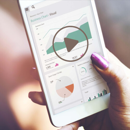
1. Animated charts…perfect for showing trends
A big advantage of Data Visualization in video concerns the possibility of using animation to break static graphics. This is not only an aesthetic improvement or a matter of “entertainment”, but a fundamental aspect.
For example, animation offers the possibility of visualizing and focusing on trends that develop over time.
And it provides the opportunity to get an immediate idea of how some outputs vary as different inputs vary: this is a fundamental aspect for everything that concerns both the processes of analysis and those of decision making. Why?
Because it allows you to introduce cause and effect relationships that can then be governed and influenced.
Another great opportunity related to animated charts is the ability to insert variables in real time, even from different sources (if the data visualization is shared in video): and this makes it possible to have a perfectly dynamic picture, a sort of precise simulation and easy interpretation of what can happen in the real world.
It goes without saying that the involvement of the recipient of these visualizations is much greater than with traditional static graphs.
2. From data to data-telling
We’ve just mentioned recipient involvement as an important key to effective data visualization. On this point, we can go much further, always by exploiting the potential of video.
It’s a matter of overcoming patterns made up entirely of numbers, graphs, and percentages to move towards storytelling.
This information, in fact, is a snapshot of different realities that can and must be told. And, in this sense, there is no better tool than video. That’s because, thanks to video, even very complex messages can be conveyed in a very effective and dynamic way.
You can insert comments, contextualization, and real calls to action from the audience that is watching. And it can be done in the most diverse ways: from streaming interventions to the insertion of animations.
But when you aim for effectiveness there’s an even more important element. It’s something very old that, today, can be done with the cutting-edge tools of Digital Transformation. We’re referring to the ability to know your audience, your target audience. And we’ll tell you about that in the next point.
3. The personalization boost
Not all data is the same, not all data is equally significant. And aiming for effective data visualization through video translates into the ability to bring out the data that matters most, according to your objectives, from the mass of information available. But that’s not all.
When it comes to building an effective presentation, the target audience is a key element to consider.
To put it another way, you have to ask yourself: what is our audience? What kind of people does it consist of? What are their characteristics? What questions might they have? What needs? And what do they expect from us?
If you are able to answer these questions, you will also find the secret of effective communication…because it can be tailored to your target audience. At this point, however, you might think that all of this is impossible when faced with very large and diverse audiences. But you’d be wrong.
Because the possibilities of personalization, which are offered by specialized video platforms like the one made available by Babelee, come to our rescue. What are we talking about?
The possibility of designing your videos on the characteristics and navigation choices of those who watch them, all in an automated and instantaneous manner.
It’s a real revolution, also in the field of Data Visualization. No more one-size-fits-all presentations and communications, but one-to-one, interactive…in fact, personalized.
4. Omnichannel optimization…something not to be missed
Let’s close by returning to a more technical, but no less decisive, aspect of Data Visualization: video.
We must never forget that, today more than ever, there is no single way to view videos. There is no longer only the PC screen. But there are also tablets and smartphones, which are now also work tools. And it’s not just a matter of device.
A Data Visualization video can be posted on the company website. It can be projected during a conference, in-person or remotely. It can be sent to individual recipients (perhaps in customized mode) via email. It can be posted on social networks. But also via text message. Or inserted in a dedicated app.
There are many channels, and they are constantly multiplying. And each channel has its own technical characteristics, its own written or unwritten rules, its own different ways of using them.
Any video production must take all of this into account: it must always be optimized, as automatically as possible. If this doesn’t happen, the price to pay is poor quality, difficulty in visualization and comprehension, a collapse in the involvement and attention of the viewer. And, ultimately, the result is a poor and counterproductive image of the company itself.
So: omnichannel optimization requires your absolute attention! It’s not just an empty buzzword.
We’ve come to the end; but we want to give you one last extra tip, one that is equally important: when it comes to Data Visualization through video, never forget that while you’re sharing information, you’re also collecting a lot of it. This information tells you if your presentations are effective, if they are reaching the right target audience, and about what worked and what didn’t.
Treasure this data, and use it to continually improve your communications.

Copywriters, video creators, digital marketers and developers: this is who we are! Young, passionate, geeky and very keen on media and technology. Fancy to meet the team? Contact us or submit your cv, we love talented people.